
Unit 1 - Postcards

1
Photoshop Experimentation
For this image I have combined 3 images in one to create an angry cat scene by changing the colour of his eyes and adding aspects to this image that make it look like he's mad and tried to make it as realistic as I could.
I have then made a refelction in the water so that the image looks far more interesting to look at and fills the whole page.

2
I have also decided to improve my image by adding small detail like lasers into the eyes so that there is more of a focus onto the cat rather than the background. To continue with the realistic look I have created a reflection for the lasers too so that the image looks 3D and has some depth in it.
Past, Present and Future postards.
This unit will be based on developing poscards that will be based from either the past present or the future including many aspects of visual language and skills in photographic composition.


Research:
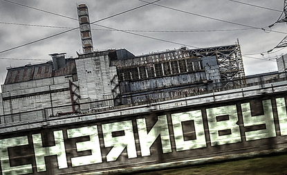
I chose to try out Chernobyl disaster which occured in 1986 where a sudden surge of power during a reactor systems test destroyed Unit 4 of the nuclear power station at Chernobyl, Ukraine. The accident and the fire that followed released massive amounts of radioactive material into the environment because of this incident I decided to base my postcard around this topic and use colours and composition to create a story within one picture frame. I chose this specific idea as it interested me and I thought it would work very well with this unit.

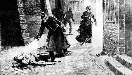


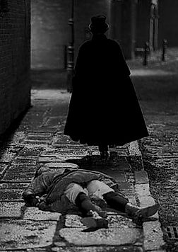
This is another one of my initial ideas because its a key unsolved mystery that happened in the british history. I believed this would be a great postcard idea as theres alot of theme and colour that would fit well within this event. I would have made this very dark and have a dull feel to it but I decided not to continue this idea, as the event was far to big to create a small image out of it due to the amount of things that occured in this incident involving all the deaths and suspects.
Green screen Experimentation


+
In this exercise we practised how to remove a background based on its colour just as they would do when using a green screen. we selected all the greeen area and then removed it by creating a mask so that the background would be visible by doing this we merged two pictures into one with far more detail than you would do if you were to use quick select.


My Trial:
In this exercise we tried to incorporate the green screen into the picture so that we understood how it works and and how to make it look relaistic.

1

2
At the start which is shown in picture 1 I combined the Cheronybyl Power station and an nuclear explosion back ground to create this image that does not look very realistic as the colours dont match, in this image i also made sure that the horizon is placed on the first third of the picture. To make sure that the two pictures matched I tinted the picture orange and altered the saturation and contrast to create picture 2 which is far more realistic as it creates a dark dusty area as the place is now abondoned. The next thing i did is added an extra explosion in the background and created a smoke effect in the foreground of the image to emphasise all the radiation released from the explosions. Lastly i added the main 2 focuses that went in the mid ground and foreground, i made sure that the two images blended in well and the opacity was down, i kept the colour of the pictures to grey scale so that it empasises the idea of this even taking place in the past. At the very end i altered the curves of the image to make the look much darker but still have the centre explosion bright and vibrant but not too vibrant so it does not fit in the image.

3
This is my final design for the postcards it is inspired by the Cheronybyl explosions. I decided to focus on a certain colour scheme which turned out to be a mix of orange and grey, this creates a feeling of fire and gas followed by alot of exlosions, therefore I believe it is suitable for my event. I made sure that I placed the horizon on the first third of the picture and I also tried to have something in the background the midground and the front so that the postcard had depth and alot to look at so that it created a very detailed story behind it. To make sure that the background looked like it was in the distance I added a slight tint of blue to it so that it looked as realistic as I could make it.

Final design:
Experimentation with stop motion
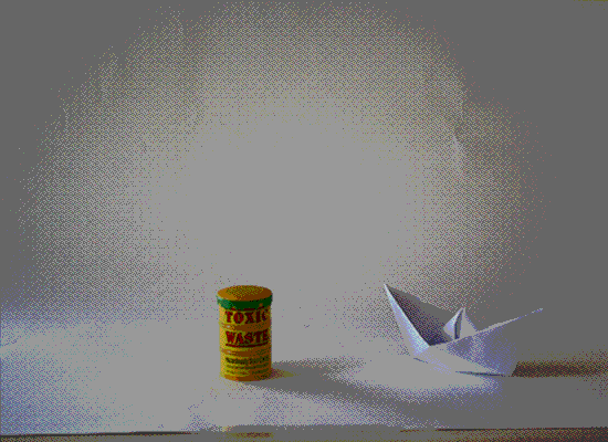
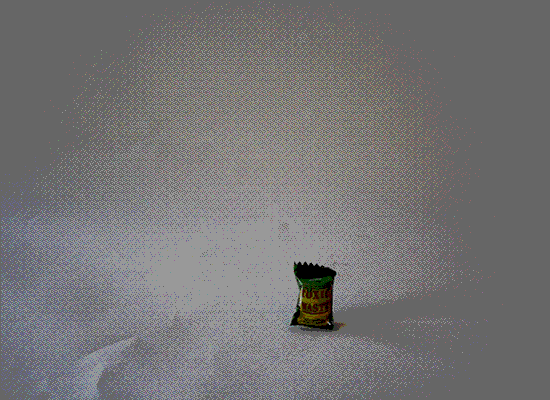
In this exercise we took alot ofshots while moving the objects slightly which we then placed into flash to create a very simple and quick stop motion.